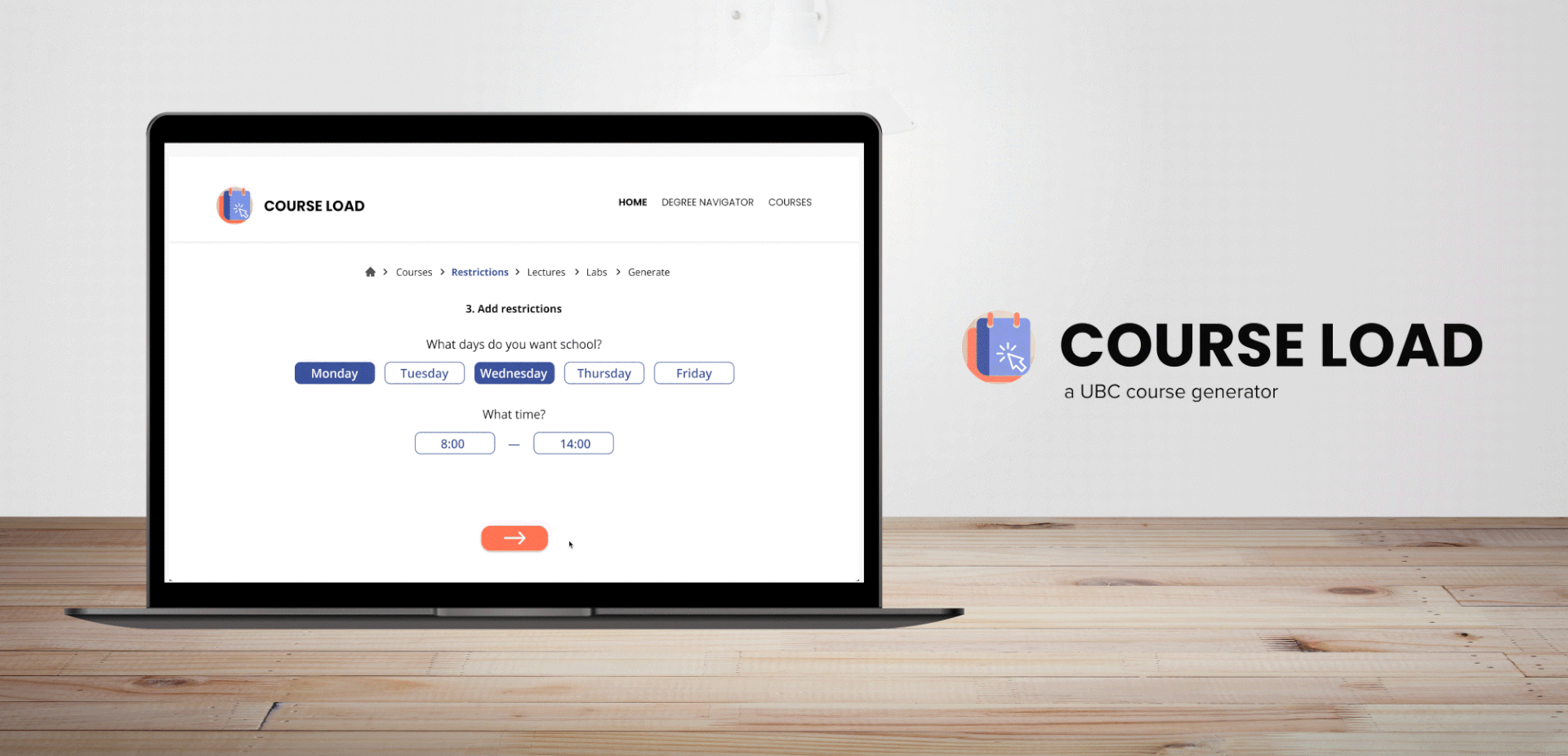
Seamlessly generating course schedules for UBC students
Course Load is a web based application built with UBC Launch Pad, UBC's leading student-run software club devoted to building projects in a collaborative and professional environment.
As a part of the Life at UBC cohort, I collaborated with a team of 10 developers, a tech lead, and one other UI/UX designer. As a designer, I helped conduct user research, wireframed and prototyped new and engaging interfaces while communicating with my team to consistently adjust and iterate according to their feedback.
TIMELINE
September 2020–
April 2021 (8 Months)
Team
1 Tech Lead
2 Designers
10 Developers
tools
Figma
Adobe CC
skills
User Interviews
User Research
Wireframing
Prototyping
The Problem
With each new school year, comes another year of countless hours of building a worklist. Worklists are lists of courses and other required sections (e.g., tutorials, workshops, labs, or discussions) that UBC students build to help plan courses before registration. For the average student, building a worklist can take hours and an excruciating amount of external research. Because of this, our team wanted to find a solution to minimize the time and effort it takes for UBC students to build their work list and ultimately, sign up for courses!
The Solution
Build, design and conduct research for a web-based application that will allow students to easily build their course time table through easier visualization and the integration of external plugins (e.g., rate my prof).
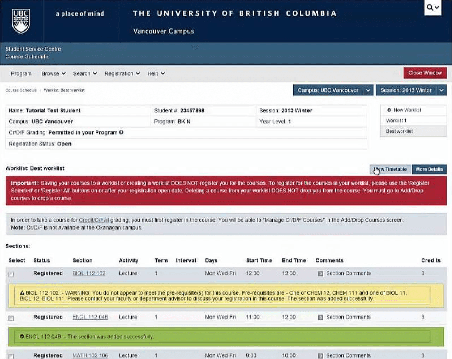
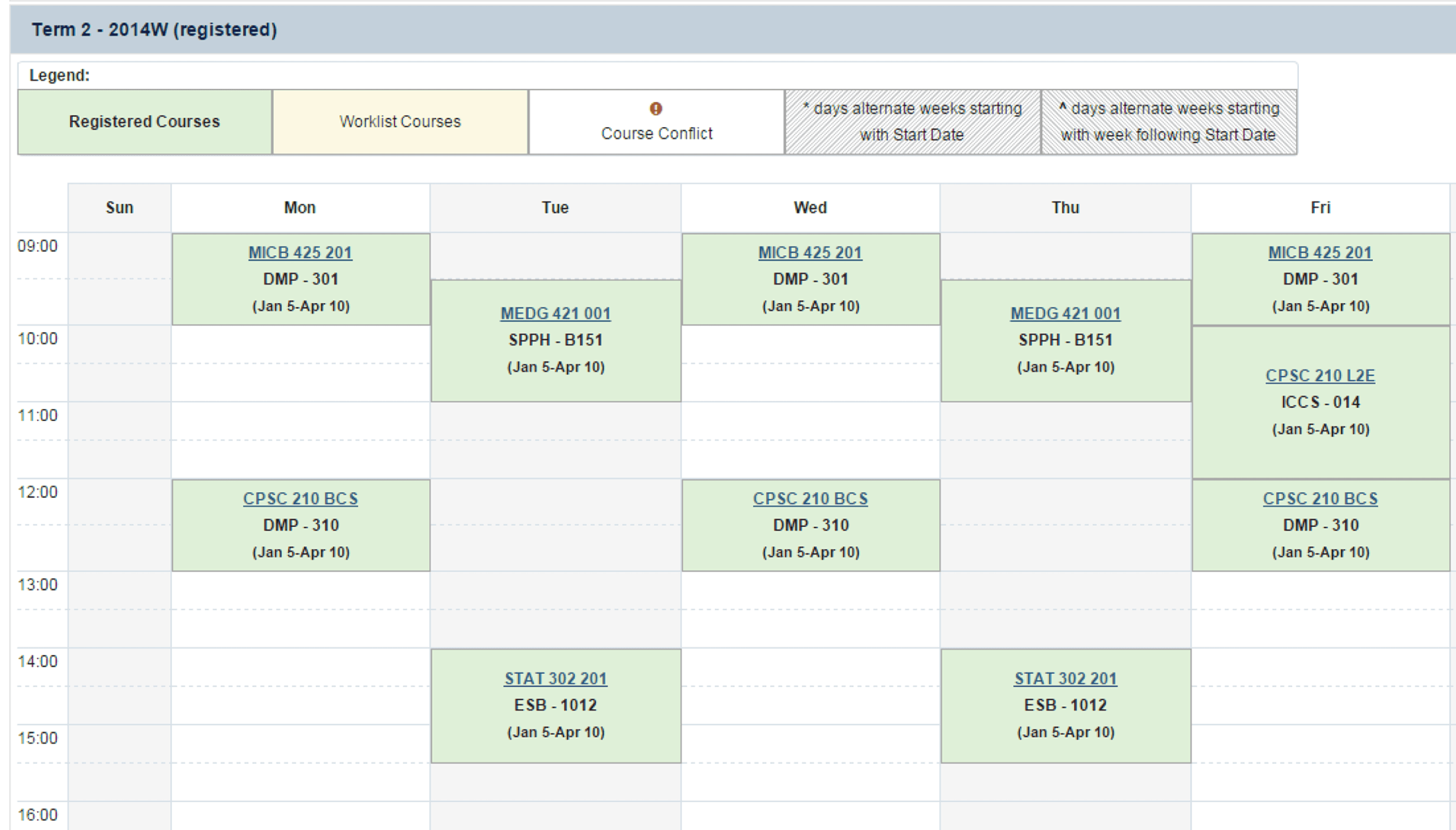
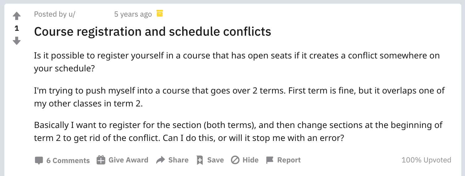
UBC's Student Service Centre current Worklist System
RESEARCH
The first thing we did is identify two core features that we wanted to base our project around:
Recognizing these core features allowed us to determine how to structure our surveys and come up with questions to include. More specifically, we wondered
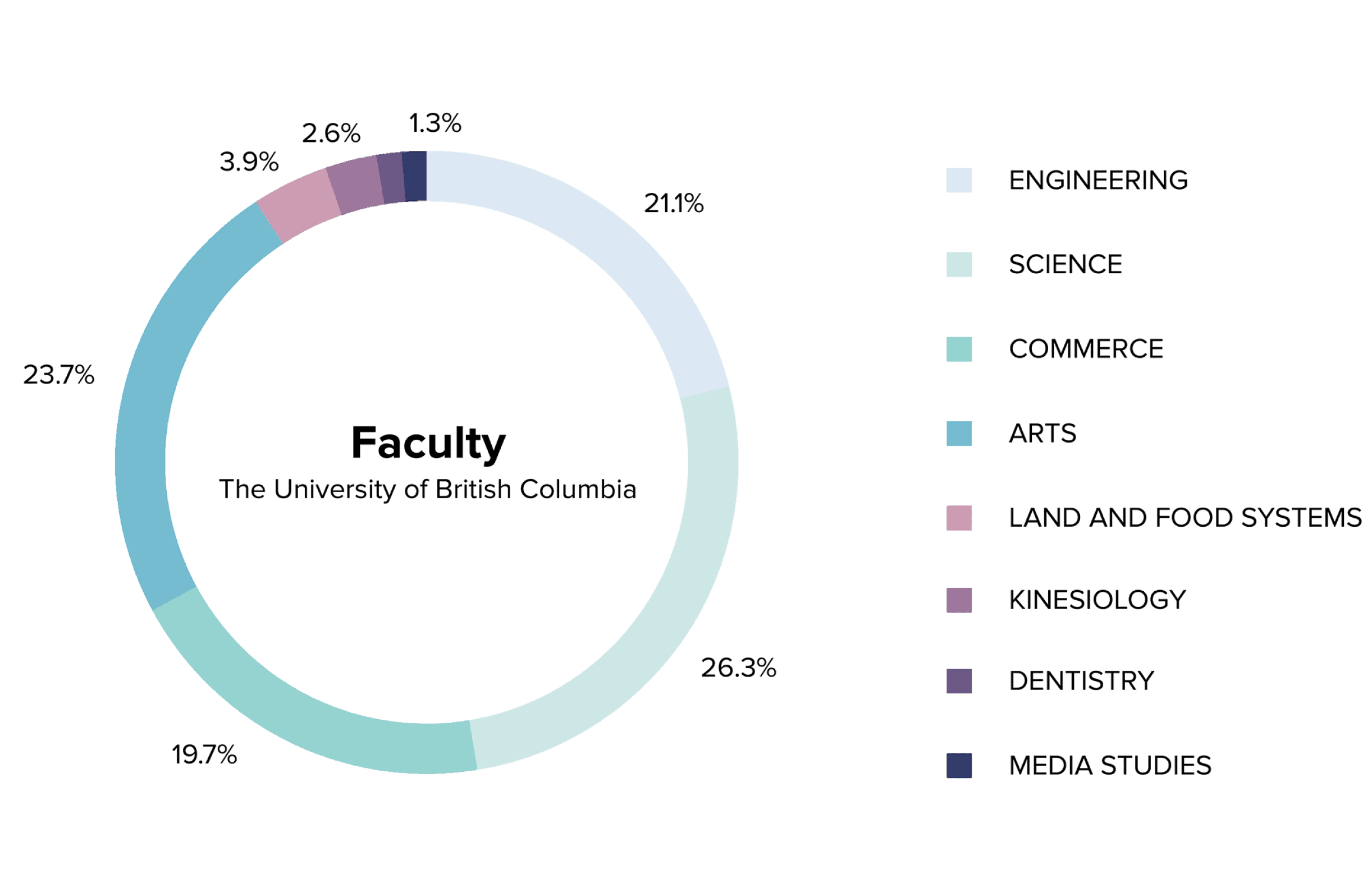
We surveyed a wide variety of students in different year levels and faculties.
In particular, we were able to able to survey 76 students from eight different faculties in order to gain a deeper understanding of how students went about building their course schedules.


SECONDARY RESEARCH
Along with our surveys, we decided to dig deeper into the problem by talking to our friends and checking different forum websites, such as UBC Facebook Groups and Reddit posts — not necessarily your traditional sources of research but after some time at UBC, it's been recognized that these websites can be quite the hub for university students!


KEY INSIGHTS
With both multiple choice and short answer questions, we were able to receive a number of different data points which allowed us to identify patterns and important functions we should work to implement in our solution.
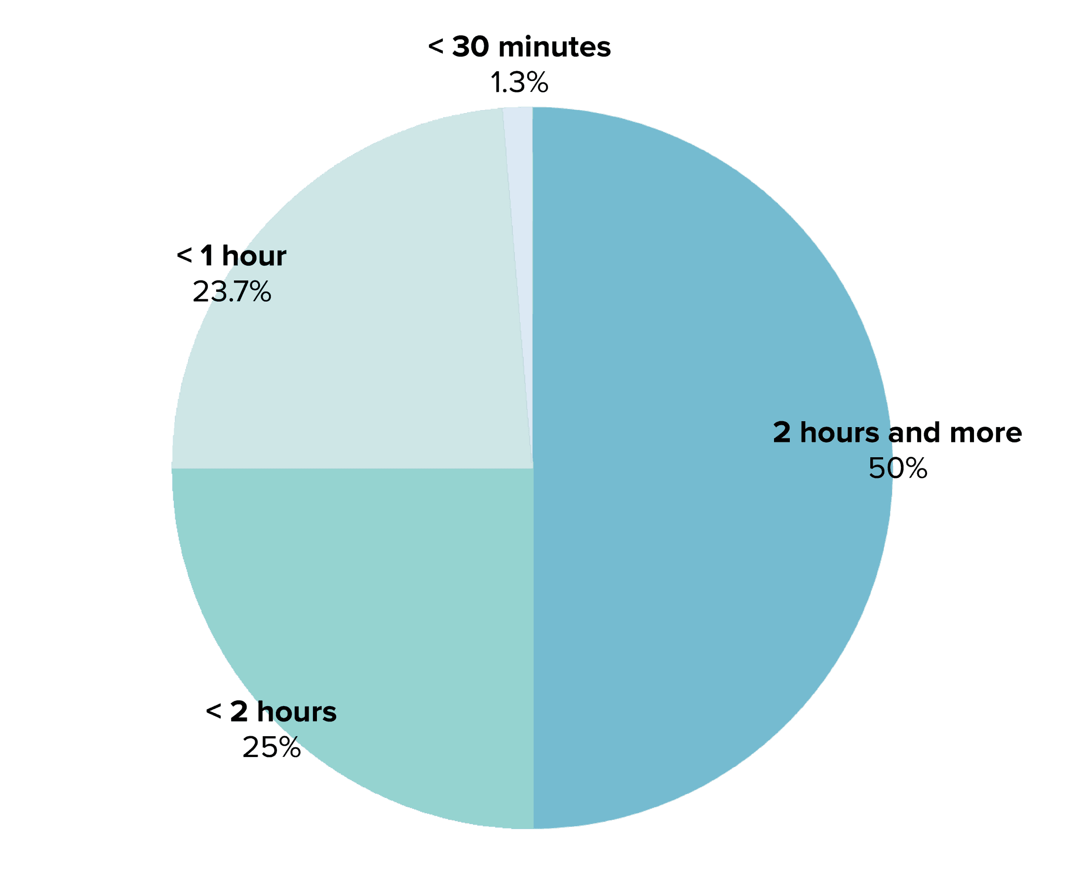
First, we wanted to get an idea of how much time the average student spent building their course schedule. From our findings, we found that about half of our participants spent over 2 hours. Why is this so?
Time spent building course schedules
More specifically, what were students spending the most time on when it came to building their course schedule? With our survey, we identified some of the biggest frustrations with worklist planning.
81%
found it difficult to see all the class availabilities/options
81%
had difficulty comparing professors in various sections
54%
think it’s difficult building worklists while accounting for breaks/days off
24%
find it takes long to add each class to their worklist
From these findings, we also wanted to identify what students liked most about the current worklist builder, and what they wished could be incorporated. We found that
86%
liked the ability to visually see each time slot relative to their course
75%
liked the option of being able to make multiple worklists
59%
liked how courses showed pre-requisites in the information box
51%
liked the ability to add/drop courses from the worklist
COMPETITIVE ANALYSIS
Prior to building this application, our team was aware that there have been other external course generator apps built by students before. Although these programs do exist, we found that separate schedules were created for every additional required section (e.g., tutorials, workshops, labs, or discussions), allowing for schedules to build up as more classes were added. Additionally, we found that there was not much visualization or information about each class shown, a function that appears to be important to students.
Now, let’s synthesize...
EMPATHY MAP
In order to create a better understanding and visualization of our user's emotions and behaviours, we created an empathy map of our user persona, an undergraduate student.
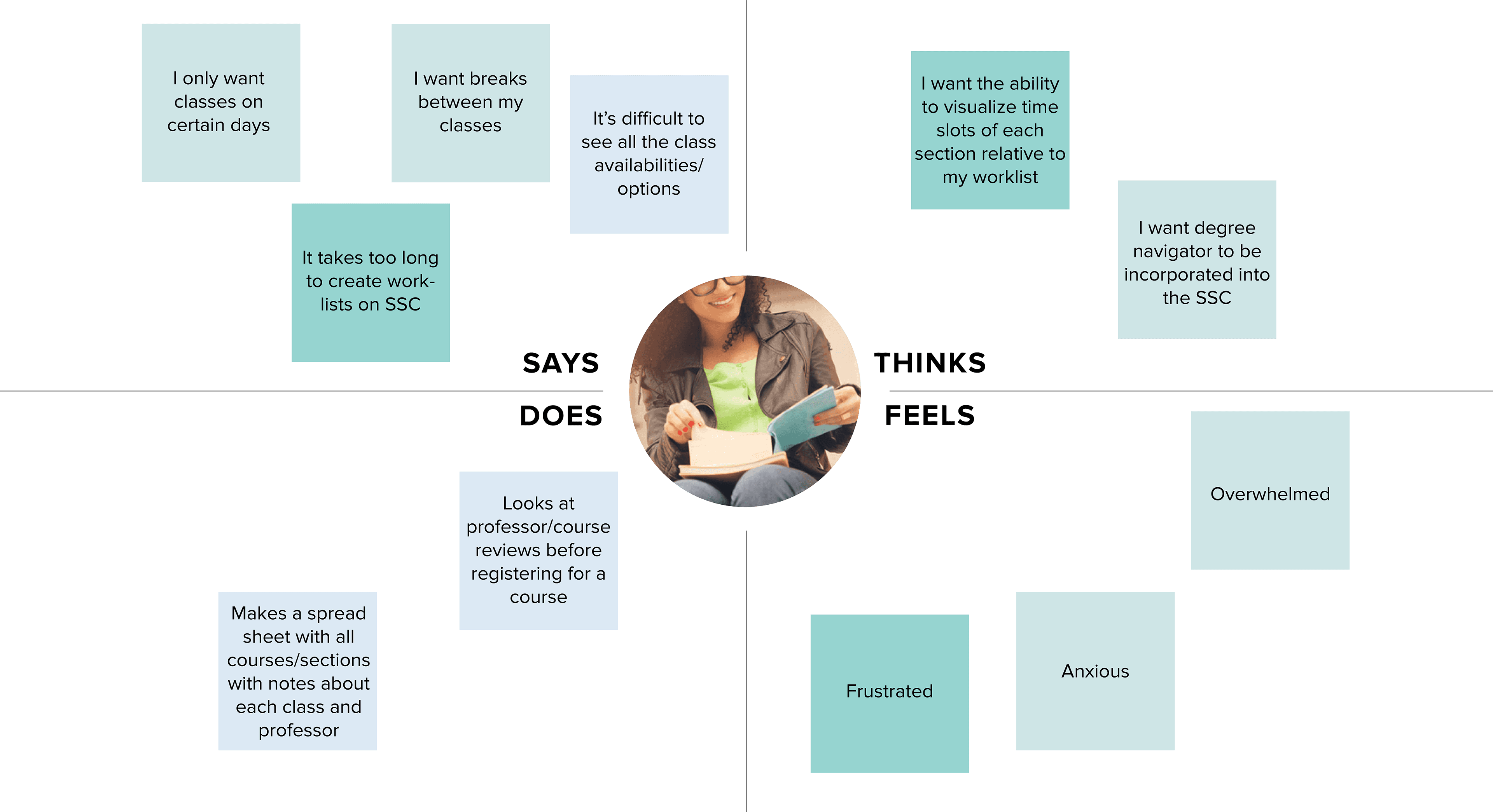
PAIN POINTS
Synthesizing this information allowed us to properly narrow all the pain points of the current worklist builder. In particular, we found that the main reasons that students were spending so long building their worklists was primarily because:
Not enough information presented on the website: The current Student Service Centre (SSC) worklist builder requires for students to find their course, before having to click on the course and read about the course information. This can take up a lot of time as students are not able to easily visualize each course and course codes can get confusing.
Difficulty comparing sections: With some courses having over five different sections, this can make it hard for students to build different worklists and accounting for each different professors, locations and times.
Accounting for breaks and days off: With commuting and part time jobs, it could be said that students want to be able to maximize their time by having breaks and days off. This can make it difficult when building a worklist as there are other factors that should be accounted for along with this.
SKETCHES
With our user research and competitor analysis in mind, we then went and sketched some ideas. Due to COVID-19, we were not able to ideate together, which meant the other designer and I had to work around some constraints. After communicating with the team, we each had a rough idea of how we visualized the app to look like. Featured below are my ideas of the user experience from the landing spread, as well as, the other designer's idea of how we could incorporate the Standard Time Table (STT) — a pre-planned timetable, used by some faculties, which incorporates most of the courses required for a program — into the course generator.
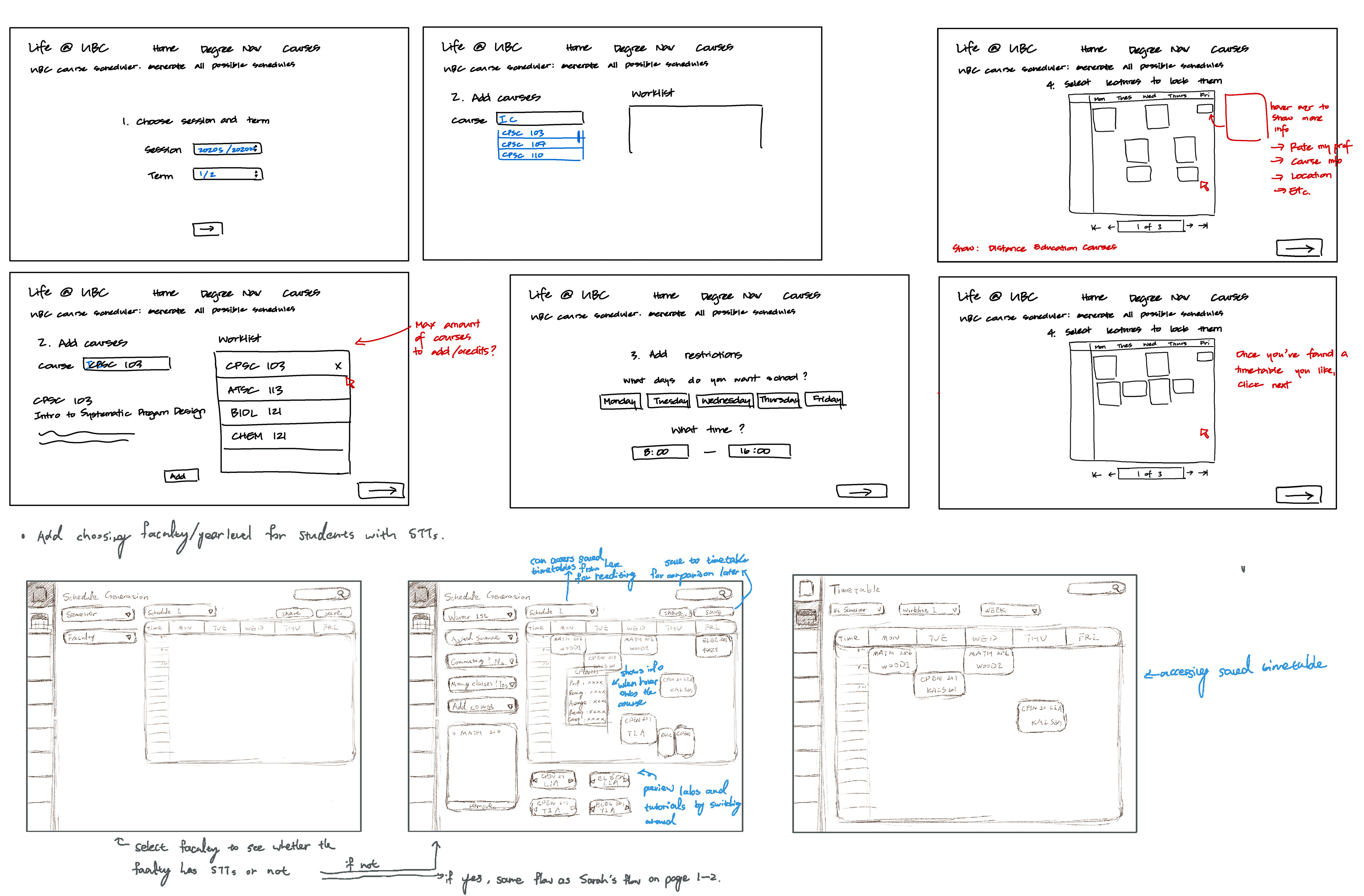
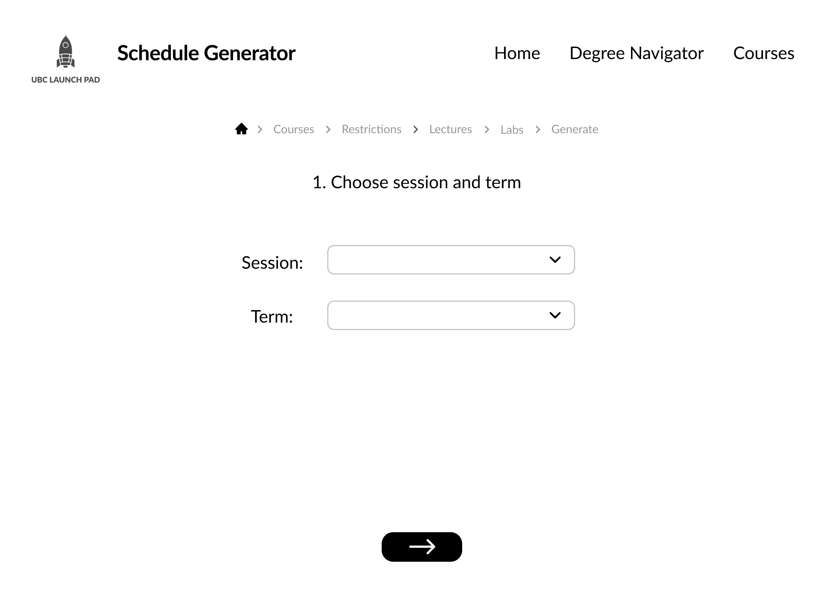
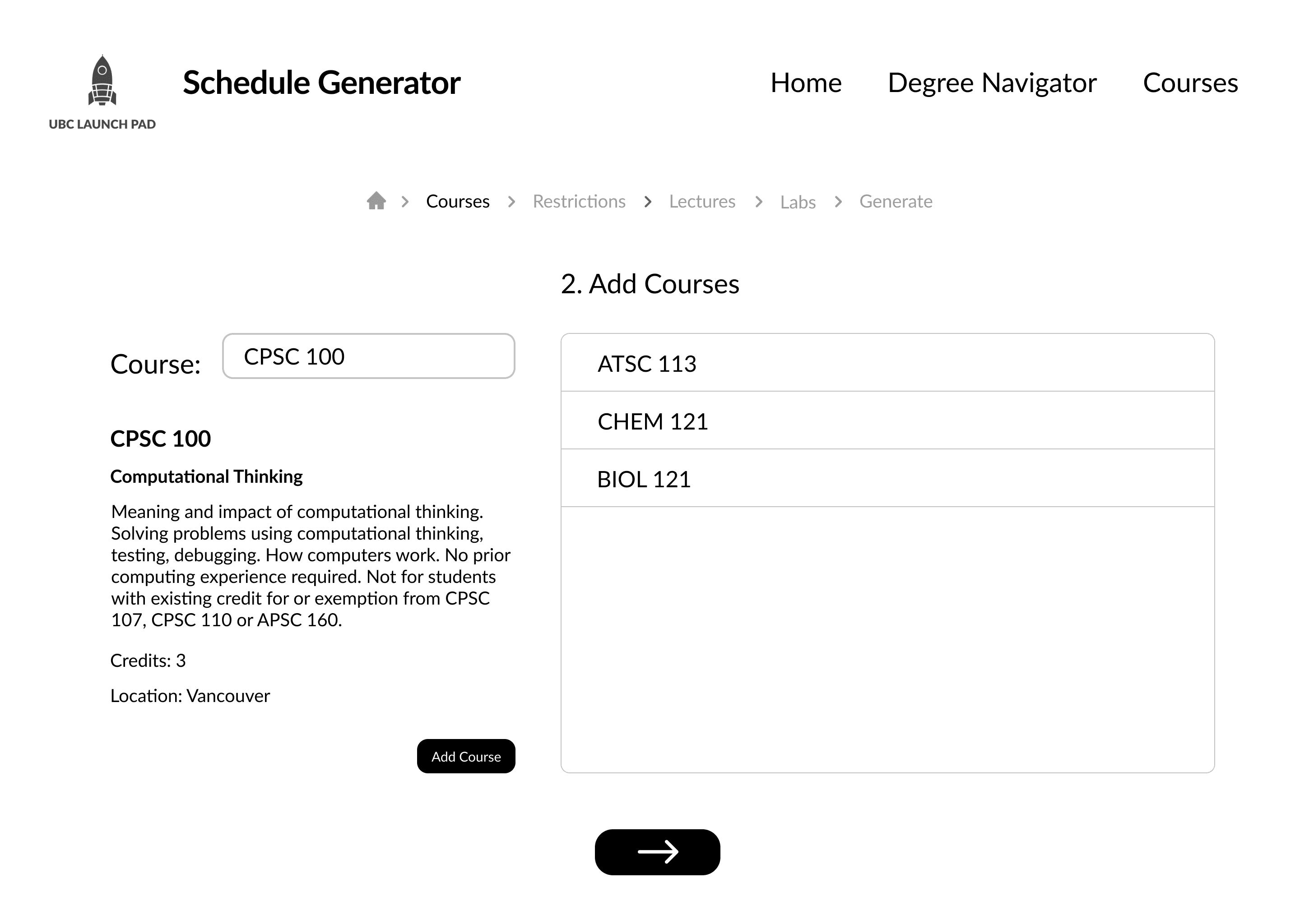
MID-FI FRAMES
We then went about creating our mid-fi frames. Because both of our designs had different functions, we had to find a way to create a hybrid which included both functions cohesively into one design. Below are the mid-fi frames before we merged the two together.
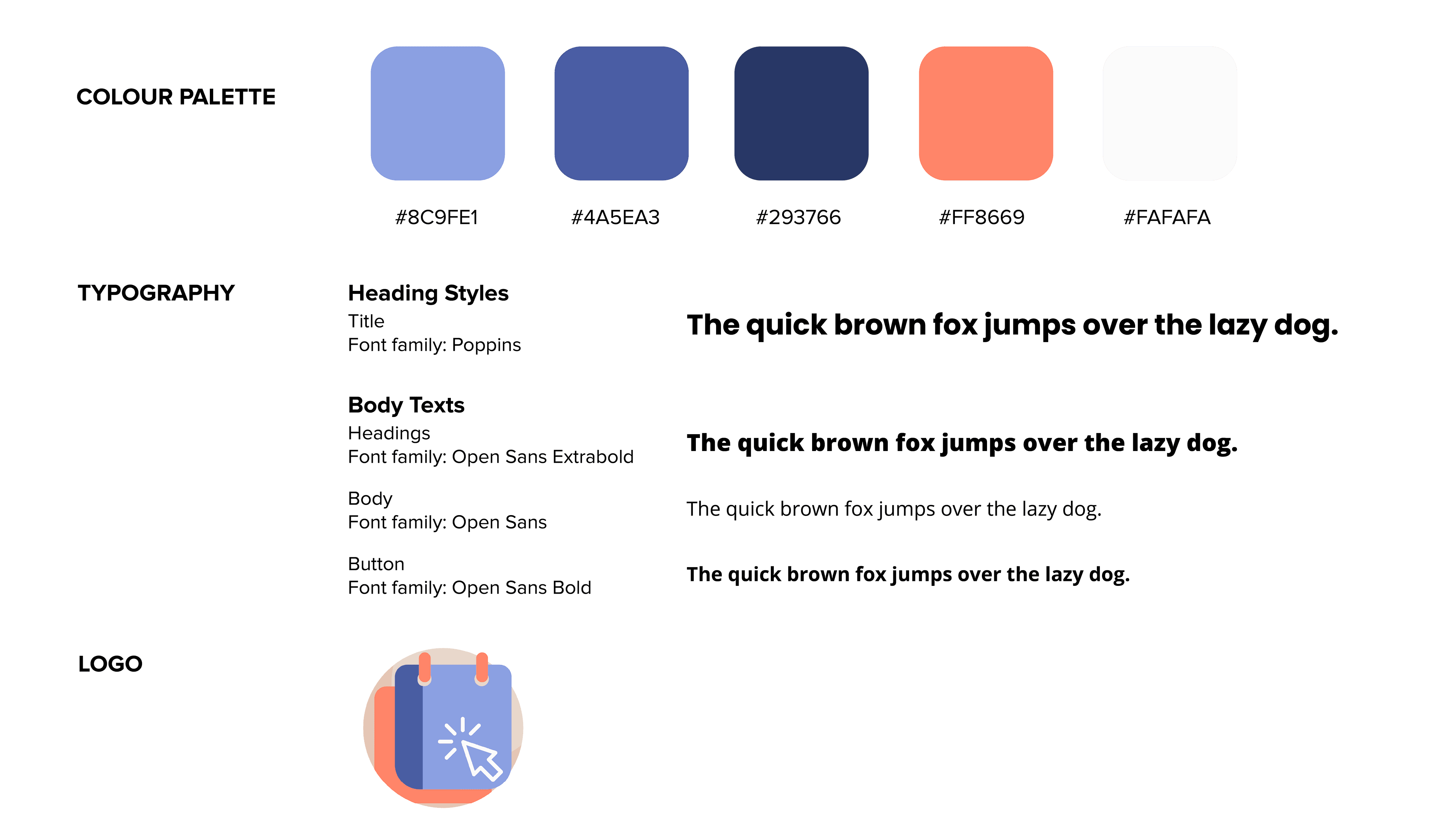
UI Library
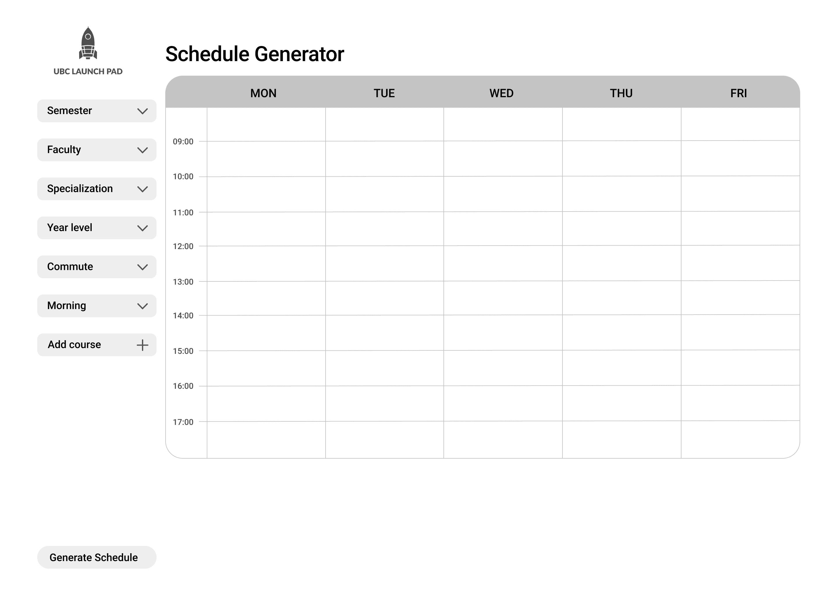
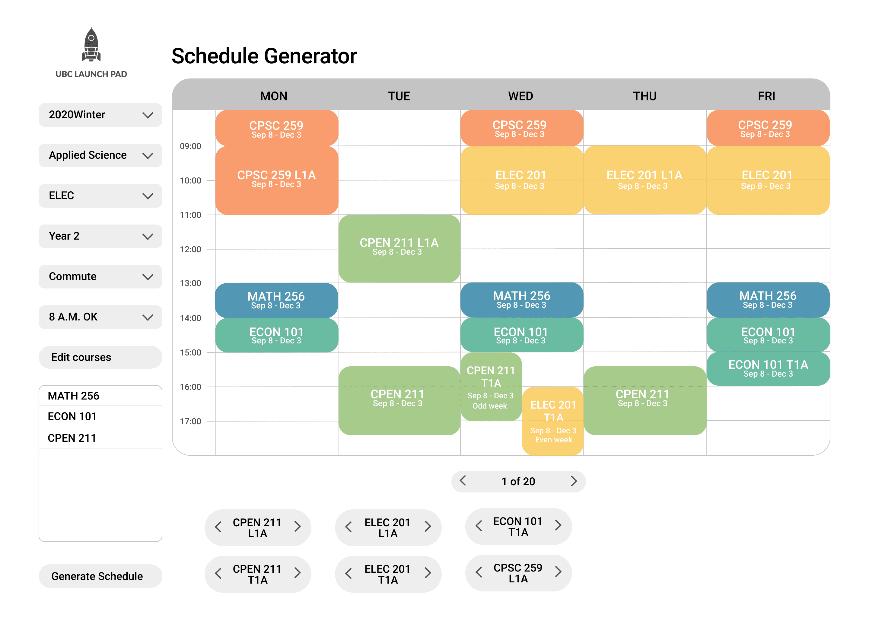
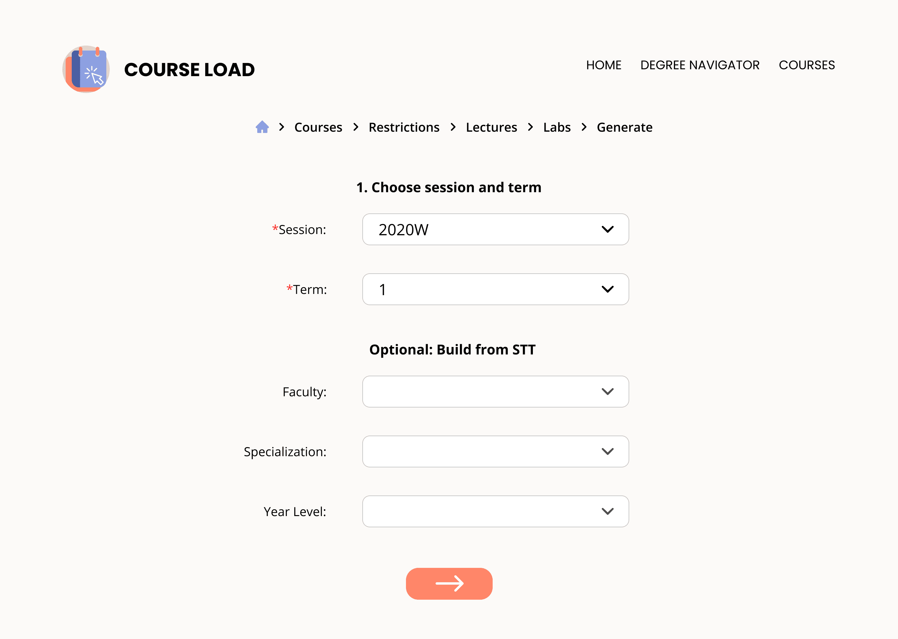
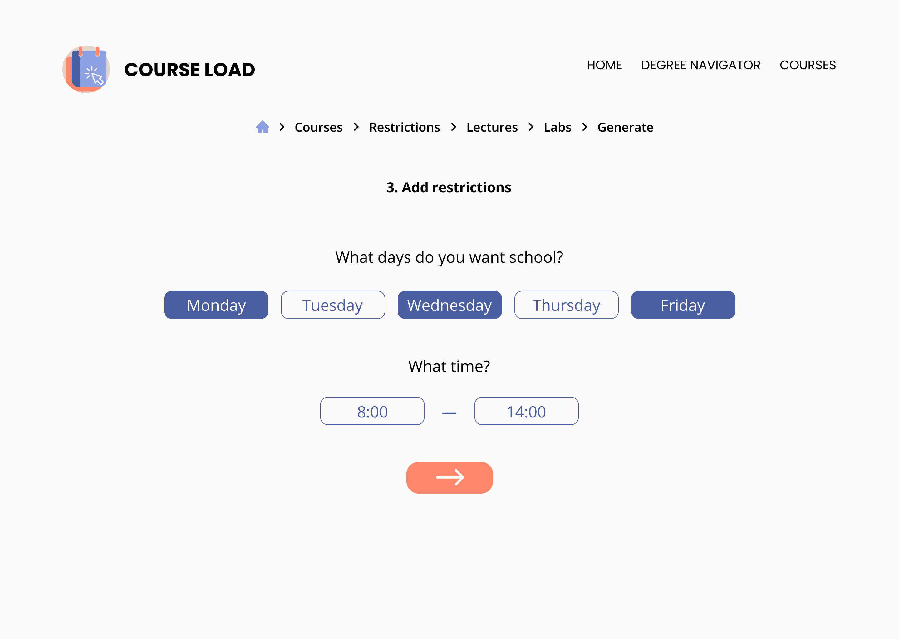
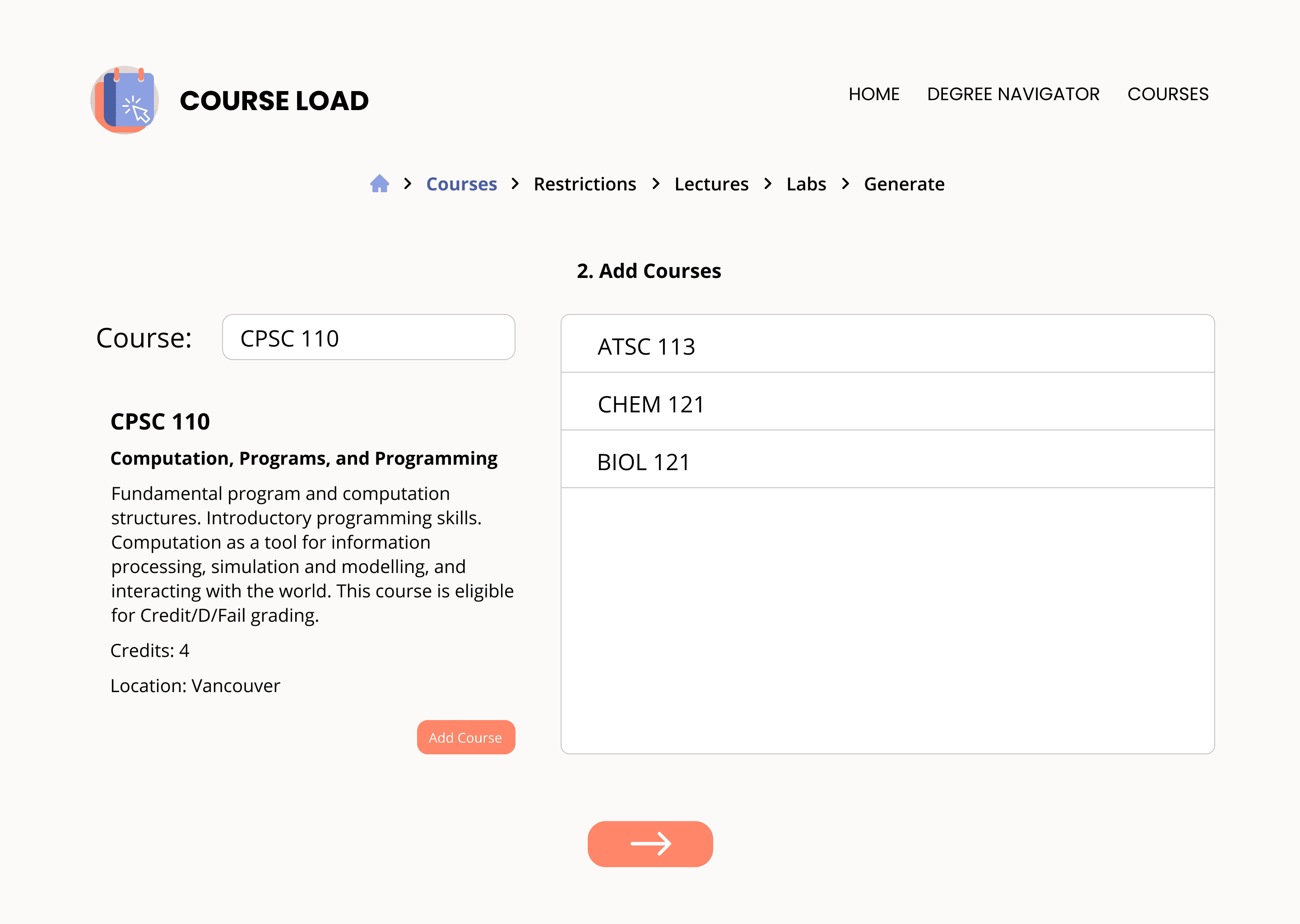
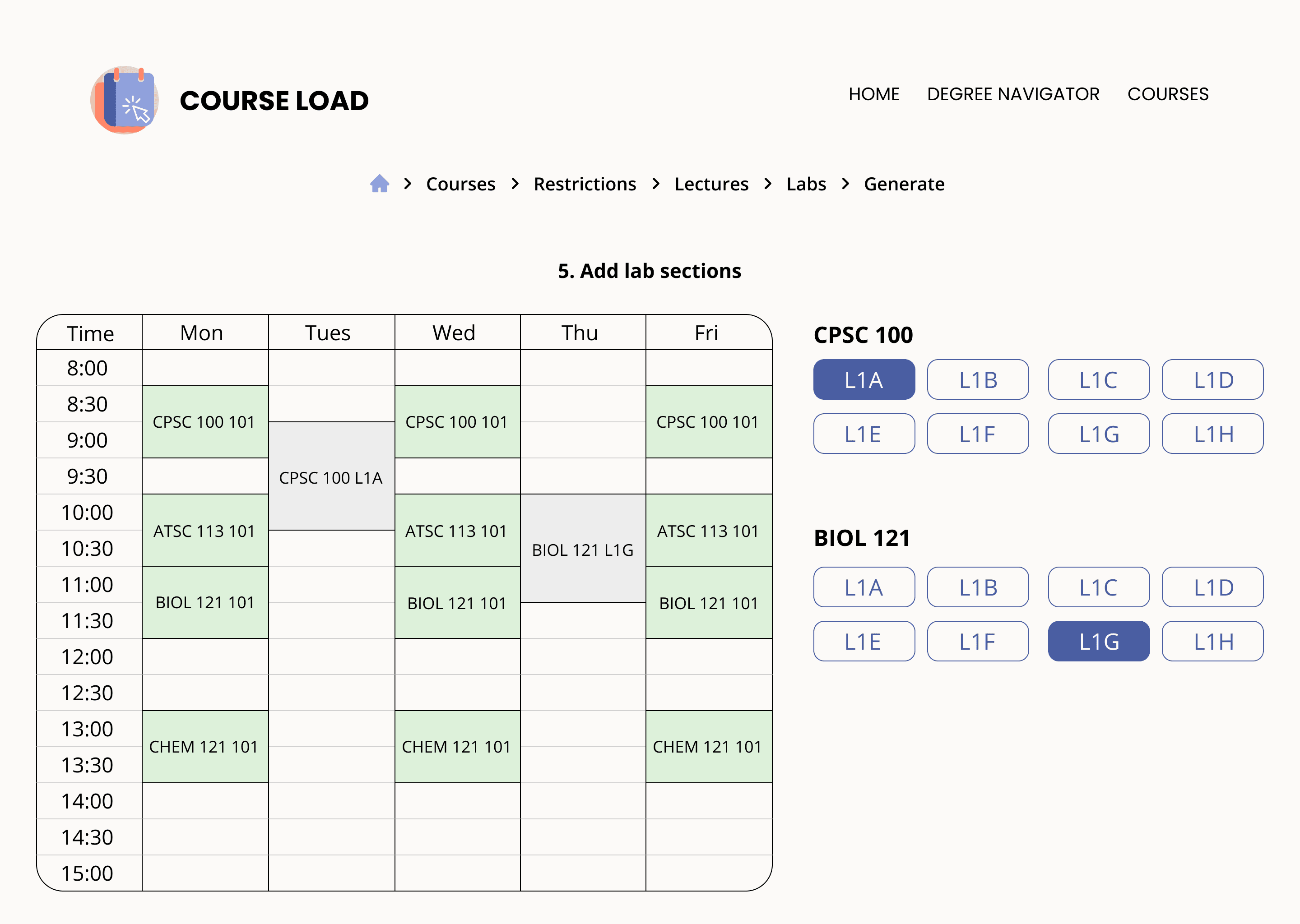
HI-FI WIREFRAMES
KEY TAKEAWAYS
This project was super gratifying for me as it's a problem that I personally face as a student and it was rewarding working around the various problems that can arise in putting together a worklist and planning for courses. Hopefully, I will be able to use this product myself this upcoming semester!
As my first project in working with a cross-functional team including other developers and individuals from non-design backgrounds, I learnt a lot about being able to communicate my designs and defending certain design choices, especially to those who may not understand specific flows or information architectures.
As the project progressed, we also faced a number of edge cases which we had to design for — such as an option to edit your worklist, as well as, an error page in the case that there were no courses or worklists available to be generated. This taught me a lot about designing in short time frames, and thinking of edge cases earlier in the design process in order to avoid problems later on. Due to various constraints, there were also a few cases in which the developers were not able to implement our designs. In order to combat this, we were challenged to think of other ways we could iterate upon our designs, without losing the main function and flow of the pages.